megan
Designer · Storyteller
Strategy, identity, UX, narrative, client discovery, visual direction.
Usually found:
reading a book, with a cat (or 6) in her lap, and a cup of coffee; daydreaming about dinner; a little muddy in the garden.
Philosophy
Your digital presence should balance identity, intention, and audience experience. We call that connection architecture: design that aligns purpose & perception.
Projects
Across a range of industries, audiences, and aesthetics, the throughline is work that tells a compelling story. Your business and your audience deserve to hear each other clearly.
Process & Services
We collaborate with you to ensure every design decision supports your unique narrative while considering the experience as a whole.
We get to know your business, your audience, and what success looks like for you.
We find the story and the structure, then agree on a direction together.
Design and build, with check-ins along the way so nothing comes as a surprise.
We put it into the world and make sure you have everything you need to run it.
We stay in touch as your business changes, and adjust the work when it needs to.
About
Different strengths. Shared standards. 14 years of figuring things out together.
Designer · Storyteller
Strategy, identity, UX, narrative, client discovery, visual direction.
Usually found:
reading a book, with a cat (or 6) in her lap, and a cup of coffee; daydreaming about dinner; a little muddy in the garden.

Developer · Problem‑solver
Implementation, interaction, systems, technical feasibility, build.
Usually found:
playing a video game, a dog nearby, and a cup of coffee; daydreaming about flying a Cessna 172 Skyhawk; a little damp by the fishing hole.
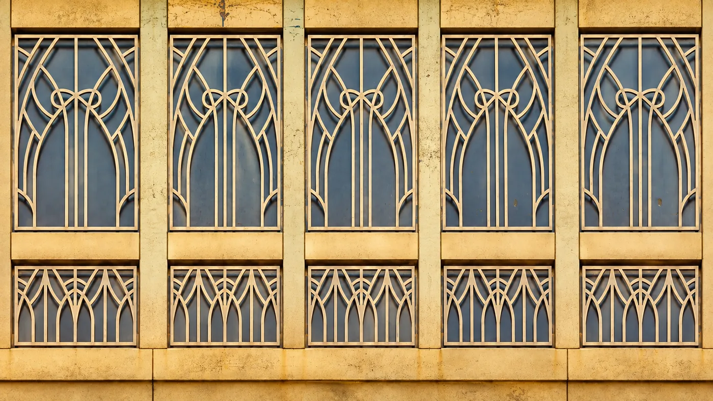
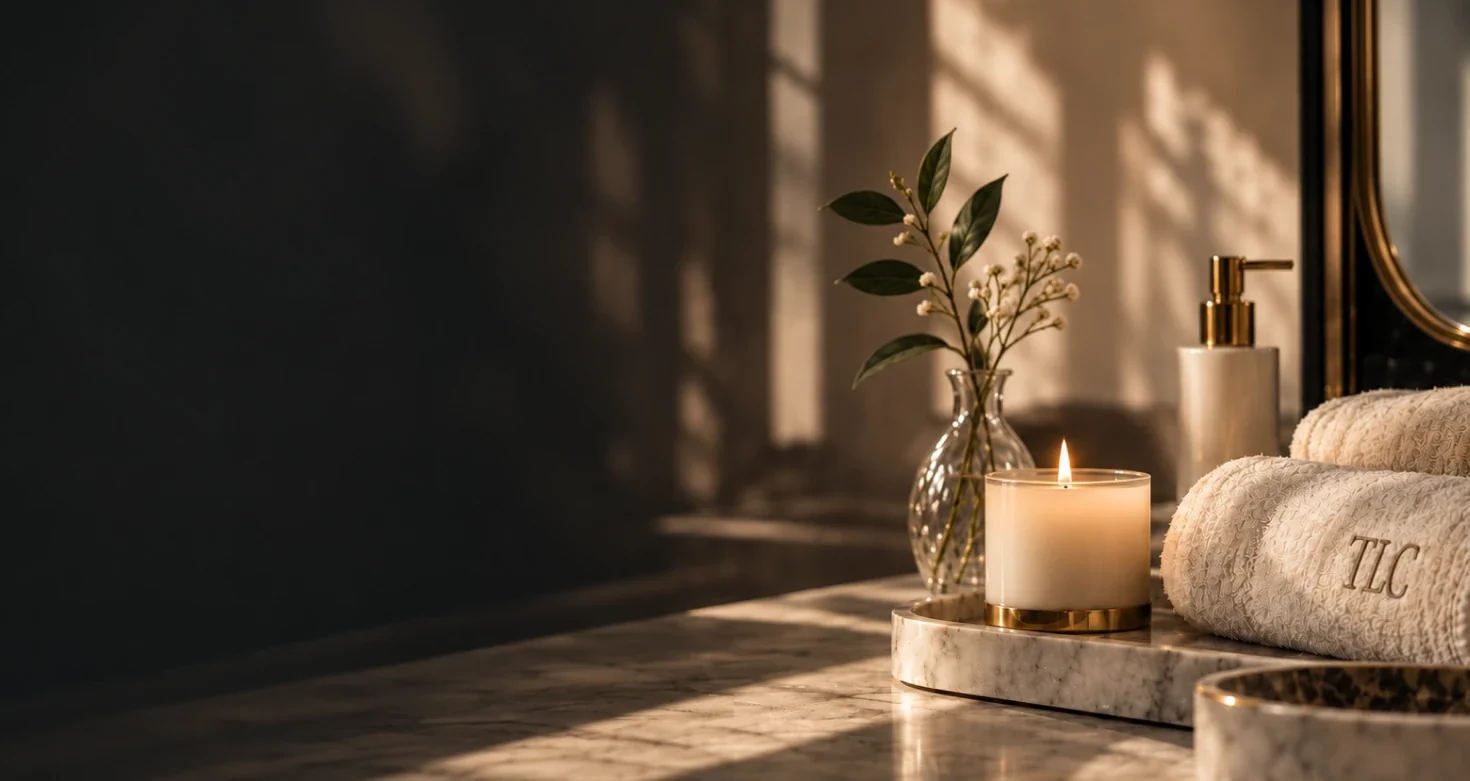
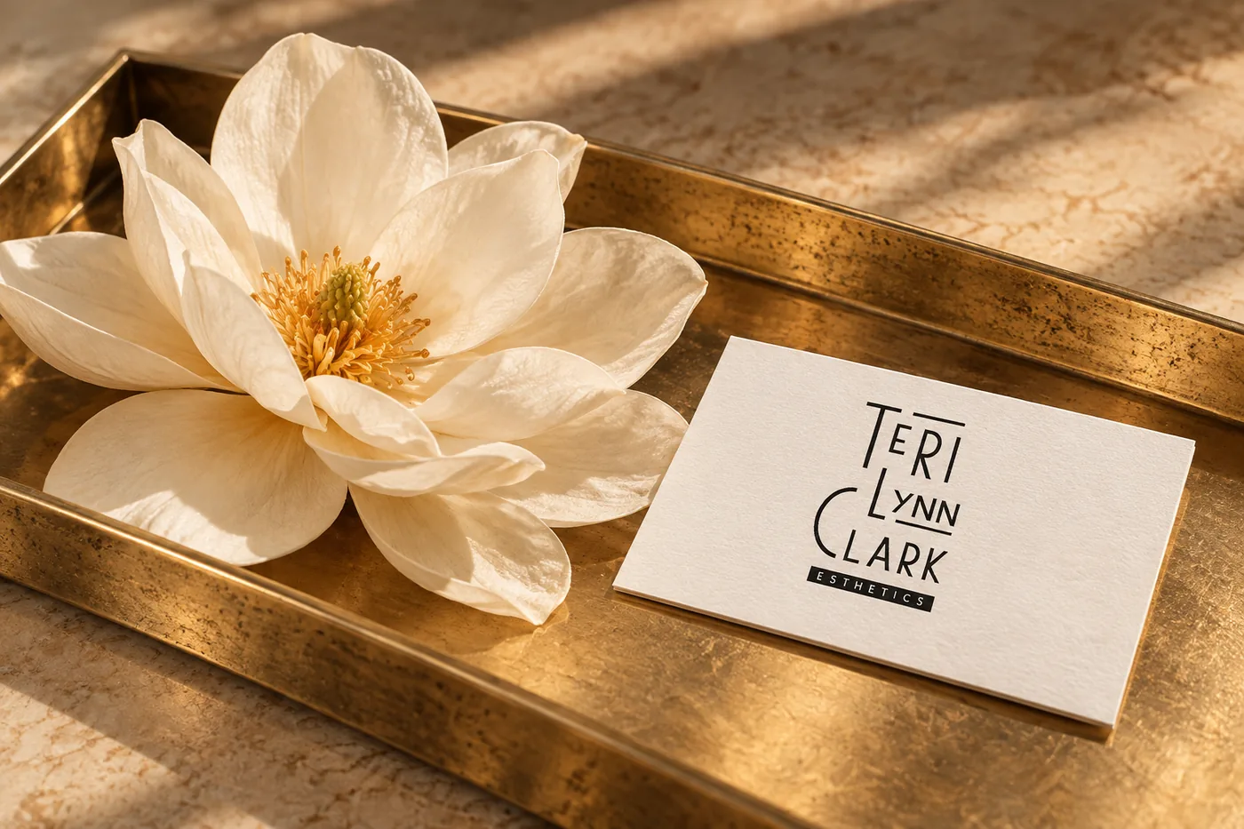
Teri Lynn Clark Esthetics came to us with an established identity and decades of experience. We drew from the Art Deco influence already present in her logo to refine the visual language across the website. The reimagined site better reflects the quality of her work and supports her as she rebuilds her clientele in her new location.

We leaned into the Art Deco cues already present in the existing logo, pairing rich tones, expressive typography, and evocative imagery to create a more luxurious visual language throughout.

Josefin Sans
Jost
Aa Bb Cc Dd Ee Ff Gg Hh 1234567890 &!$#@
The site needed to feel as calm as the service itself. Clean structure, generous spacing, and clear calls to action keep the experience polished, intuitive, and easy to navigate.

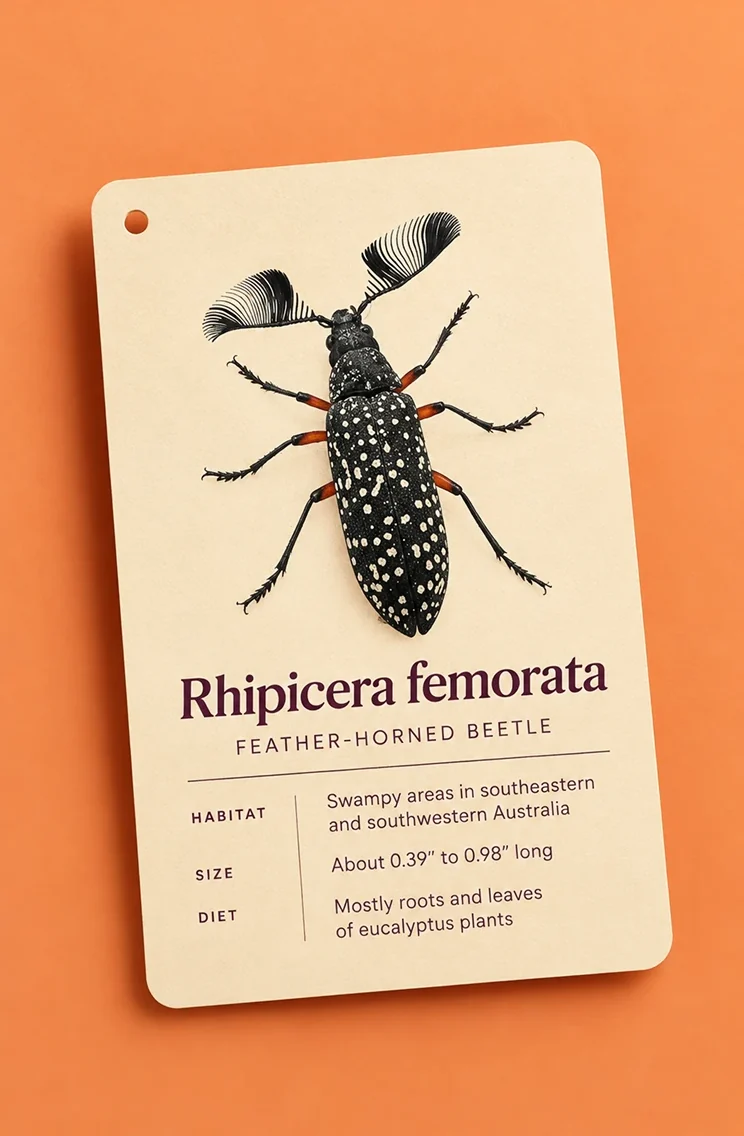
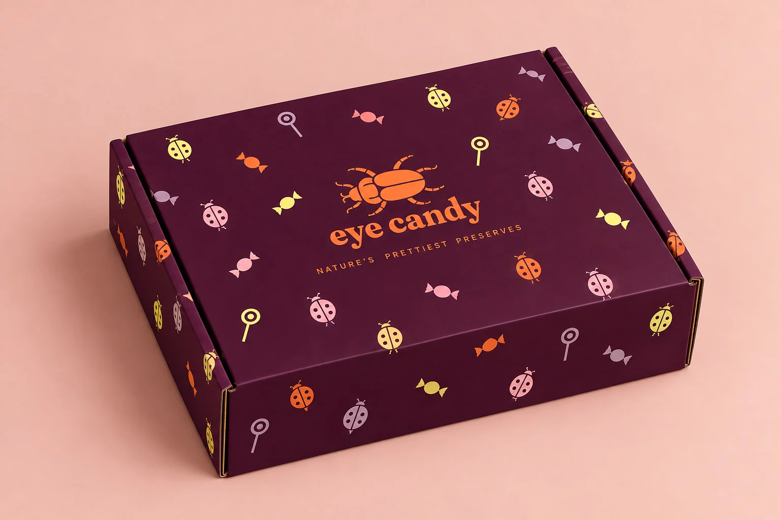
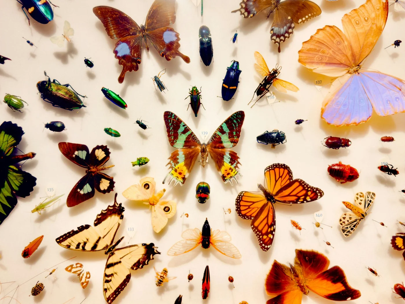
Eye Candy Specimens & Curiosities came to us with a successful Etsy shop and an established audience, but the business was ready to grow beyond a third-party marketplace. The opportunity was to transform an existing name and concept into a distinctive brand identity, then bring it to life through an independent eCommerce storefront.

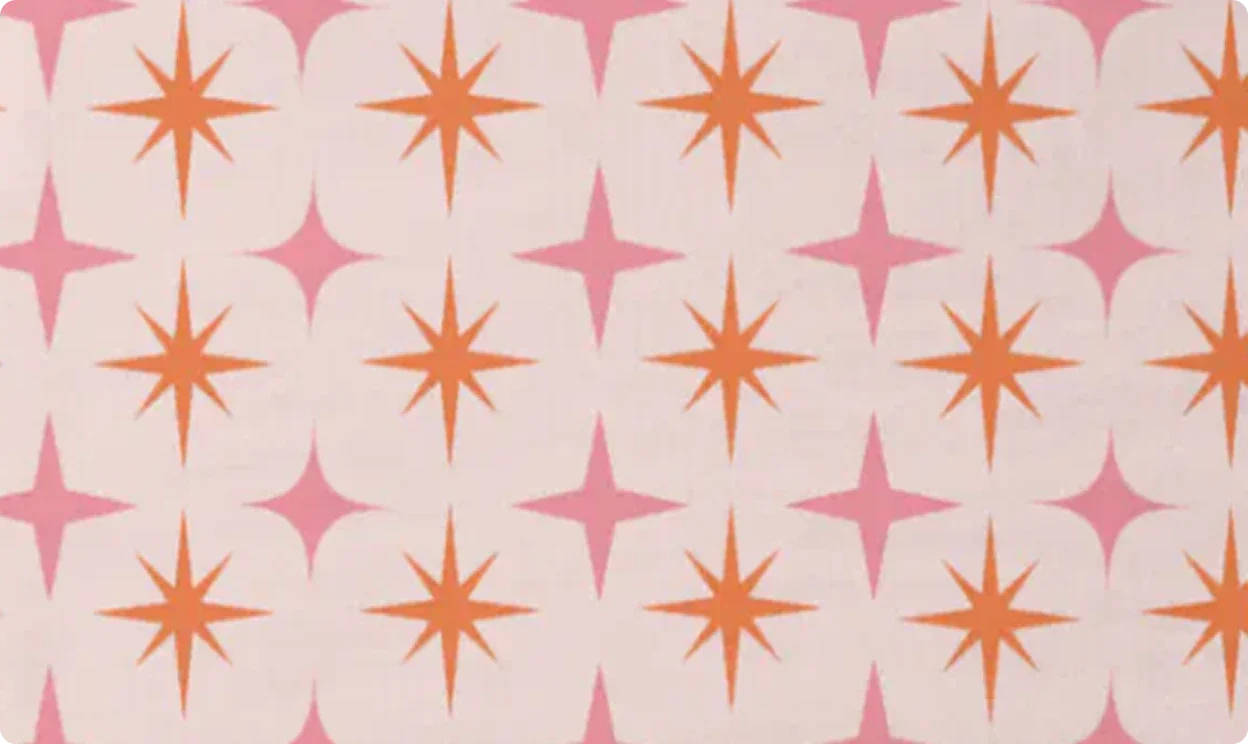
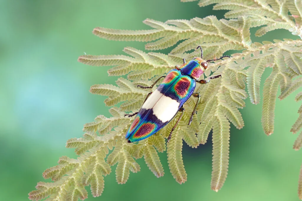
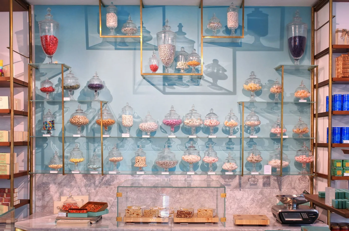
A name like Eye Candy invites a distinct visual story: specimens beautiful enough to “eat with your eyes.” Larger-than-life photography showcases the natural wonder of the beetles, while bold color and expressive typography build a visual language inspired by a traditional candy shop.
Fraunces
Fragment Mono SC
Aa Bb Cc Dd Ee Ff Gg Hh 1234567890 &!$#@
Moving beyond marketplace selling meant creating an experience that carried the personality of Eye Candy without sacrificing the ease customers expect from eCommerce. Image-led browsing, clear product information, and simple purchasing keep the specimens at center stage while giving the business greater ownership of the customer experience.